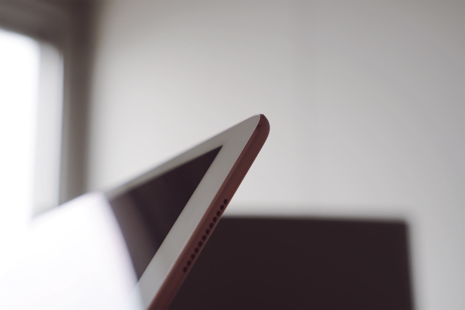
„The 10.5” iPad Pro: Future-Proof“

I was curious to see if the larger screen could make the 10.5” iPad Pro a viable alternative to multitasking on the 12.9” model, but, as I imagined, working with Split View on this iPad is the same as the 9.7” version, showing enlarged iPhone interfaces (Compact layouts with toolbars at the bottom and no tab bars at the top in apps like Safari.) instead of two full-size iPad apps at once. If you were expecting the same Split View experience from the 12.9” iPad Pro, the 10.5” doesn’t allow it.
This limitation is mostly due to 12.9” being a bigger jump than 10.5” is from 9.7”, but resolution is also a factor. While some had assumed that Apple would take the same 2732 x 2048 display of the 12.9” iPad Pro and condense it to a smaller size, the company has introduced a new resolution in the iOS device matrix – a decision, I think, made to hit 264ppi on a 10.5” panel while retaining UI elements that are large and comfortable to tap. Cramming the large iPad’s display in this model might have resulted in a richer multitasking experience at an even smaller scale, but I believe touch usability would have suffered. This resolution feels like the optimal one for this screen.
Es ist dieser Trade-off, der mir am meisten Kopfzerbrechen bereitet: Das 10.5” iPad Pro ist leichter und in seiner Größe (erheblich) kompakter; das 12.9” iPad Pro gewinnt im Multitasking, weil es zwei Apps in voller Größe nebeneinander darstellt.
Ich bin mir sicher, dass das 10.5“ im Vergleich zwischen den zwei Apple-Pro-Tablets die populärste Bildschirmgröße wird – es ist vielfältiger einsetzbar. Das 12.9“ iPad Pro bleibt dagegen ein „Desktop iPad“ – ein iOS-Computer zum Arbeiten am Schreibtisch.